
I’ve always been passionate about education. I believe every student deserves an equal opportunity to learn and equal access to a quality education. I also believe teachers should be among the highest respected members of our society, and given access to everything they need to inspire the minds of our future. Unfortunately, as we all know, this is far from reality. Students who don’t fit the standard are left behind. Teachers are overworked, under-appreciated, and hardly compensated. And while education reform continues to be a daily battle, I applaud the people and organizations that are working hard to create resources that help make education more accessible for all. TED is one such organization.
As an avid TED talk consumer, I was very familiar with the organization and their mission to spread ideas. I was much less familiar with one of TED’s many education initiatives, TED-Ed.
In their own words, TED-Ed is
“A growing library of original animated videos [which provide] an international platform for teachers to create their own interactive lessons, helping curious students around the globe bring TED to their schools and gain presentation literacy skills, and celebrating innovative leadership within TED-Ed’s global network of over 250,000 teachers.”
When I first landed on the TED-Ed website, I felt a disconnect between this initiative and the larger parts of the organization I was familiar with, such as TED.com and TEDx.

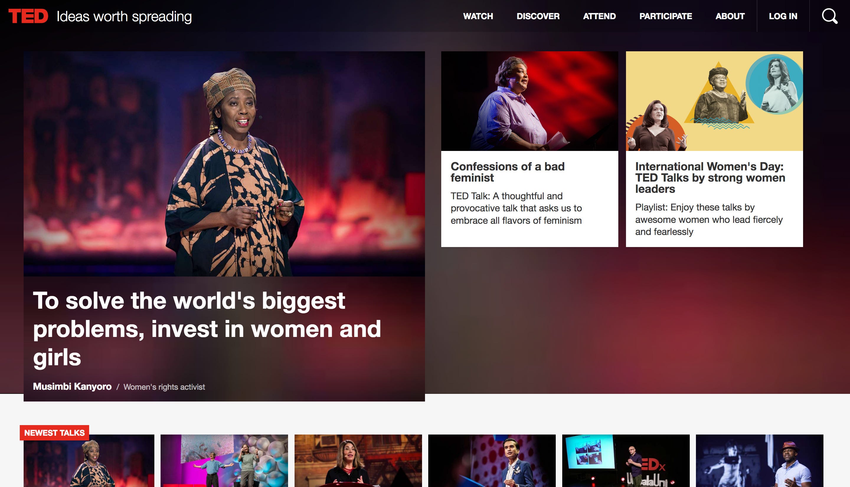

While TED.com and TEDx allude innovation and encourage interaction, the TED-Ed site felt cluttered and less inviting. This inspired me to find a way to make TED-Ed more accessible and build a better experience for teachers around the world.
Step 1: Empathize
Business Needs:
To better understand TED-Ed’s position in the market, I ran a competitive analysis between TED-Ed and three of their top competitors: Khan Academy, BrainPOP, and PBS Learning Media.
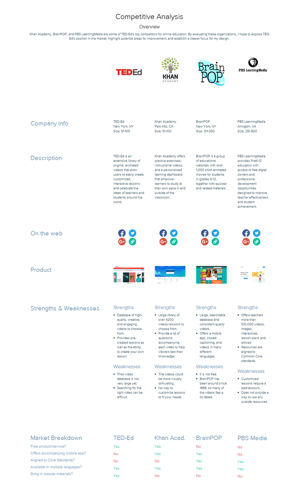
My first attempt at running a competitive analysis proved to be a little more difficult than I had anticipated. I struggled with sourcing information and deciding which stats would be best to compare. But after spending some time with it, I gained a much clearer understanding about what sets TED-Ed apart from their competitors.
TED-Ed is the online educational resource that provides the most flexibility for teachers.
This is an important distinction because while other organizations provide a wealth of internal educational videos and accompanying materials, TED-Ed allows users to transform any available educational content into a lesson that suits their needs.
Now that I knew where TED-Ed stood in the market, I needed to understand their business needs. As I began my research, I questioned whether or not nonprofits even have business needs, as they aren’t actually selling a product or a service. What I came to realize, however, is that nonprofits are selling a cause, and just like any business, they have their own set of needs to accomplish that.
What Nonprofits Need Most, a Huffington Post article by Sylia Obagi, helps explain the importance of nonprofit business strategy.
“Without a strong fundraising culture, nonprofits often lurch from one financial crisis to another. Many fail to thrive. In spite of good ideas and sometimes great potential, some simply die.”
It boils down to this: Ted-Ed needs more users to prove they have created a good product so they can continue receiving financial support from donors so they can provide better user experiences. But, TED-Ed also needs to provide better user experiences to gain more users to continue receiving donor support. It’s like a nonprofit love triangle.
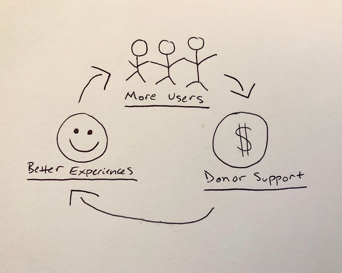
Pulling data from talking to real people would provide TED-Ed with solid proof of what their users need while also reassuring TED-Ed donors that their support is making a difference in real lives, thus continuing the cycle.
User Needs:
To gain some insight into what their users need, I started by reading reviews and blog posts comparing TED-Ed to other online educational resources. Here are some of my discoveries:
“And while it may take a bit of searching, it’ll be worth it.”
Source: Common Sense Education
“Since most videos are of specific, quite unique, teacher-submitted lessons, often TED-Ed does not have videos on more general topics. So, viewers can use TED-Ed to learn, for example, “How folding paper can get you to the moon,” but not more basic, general algebraic principles.”
Source: Planet Nutshell
“This is a tool for presenting information visually, thus sight of the user is assumed. However, multiple contrasting colors and zoom abilities may help for those with impaired sight. Sound quality, transcript availability and closed captioning depends on video source. Tips for increasing accessibility of YouTube videos are not evident on the TED-Ed site.”
Source: Online Tools for Teaching and Learning
Of course, sourcing reviews online was only the beginning. To obtain a more inclusive understanding of what TED-Ed users needed, I knew I had to get in front of some real people. I specifically wanted to talk with K-12 teachers, as I assumed they would be the most likely to use the TED-Ed platform.
Though there were several potential problem areas within the platform, I decided to narrow my focus to the process of creating a lesson. Not only is creating a lesson the primary function of the TED-Ed web app, it’s also something every single teacher does on a weekly basis. I knew that by improving this process, I could not only improve the lives of all the teachers who currently use the app, but also make it more accessible to those who have yet to try it.
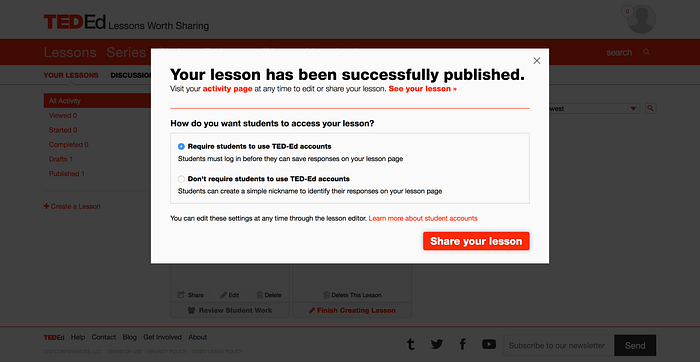
Here’s a look at the current flow for creating a lesson within the TED-Ed platform:
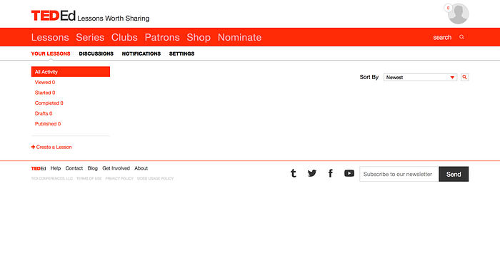
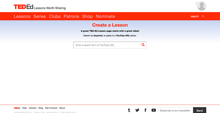
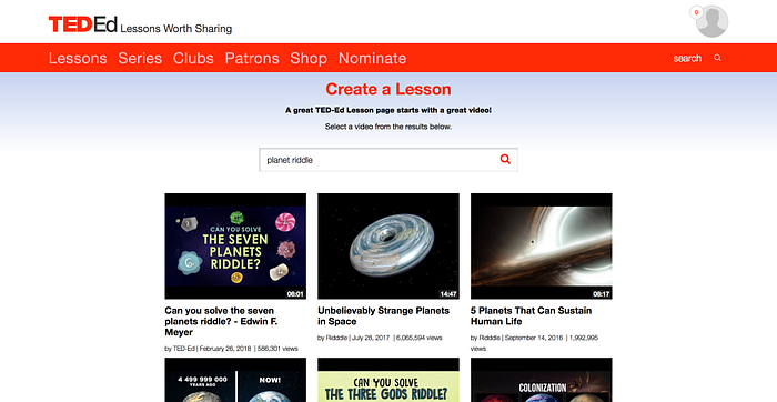

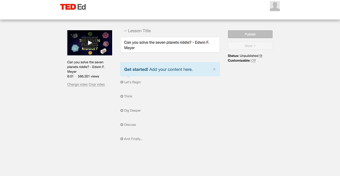

My next step was determining a structure for the interviews. I started by seeking out some advice from the pros:
“You’re talking to a human, who is sitting in front of you, being very kind to answer all of your nosey questions. Try to help them feel like they’re talking to a new and curious friend, rather than a buttoned-up researcher, and watch how your insights blossom.”
Source: Stop doing user interviews. Start having conversations. via Nicola Rushton
“So how do you actually run a strategy interview? By asking questions that will generate stories. Strategy interviews are conversations — your goal is to dig into a person’s needs and pain points as a listener. You want to ask questions that get them talking about past experiences.”
Source: All Research Isn’t Created Equal via Sarah Doody
Armed with that delicious advice, I wrote a script (inspired in part by Brad Dalrymple’s User Testing Script) consisting of some general questions about the user and their teaching experience, followed by a usability test in which I asked them to create a lesson using the TED-Ed app, and finally some follow-up questions about their experience with the app.
The purpose of conducting these interviews was to reveal any mental models my users already had based on their past experiences creating lessons and get an idea of what they expected the TED-Ed web app to do. This would help ensure that I design something that would be an easy transition for them.
Scheduling user interviews for this project was much tougher than it was for my last project. So, I decided to use an incentive ($10 Amazon gift card) to help recruit users. I finally locked down interviews with 6 teachers, managing to find some variety in age, ethnicity, gender, location, and teaching experience.
It was important that I not only talk to different types of teachers, but that I find teachers who represented a variety of students as well. Of the 6 teachers I scheduled interviews with, I was able to gather insight representing elementary, middle, and high school grade levels, both private and public institutions, lower income schools, special-ed classrooms, and bilingual classrooms. Though not fully comprehensive, this variety of insight would give me a better chance at designing a product that was more accessible and inclusive.
This was my first time using Zoom for virtual usability testing. I must admit, the first interview was a little rough. I struggled with note taking, muting/unmuting myself, and being fully present. Even being extremely comfortable with technology, conducting interviews over a computer screen was just more awkward than talking face-to-face.
After my first virtual interview, I switched to recording the entire meeting (with participant permission) so I could take notes later. Though a bit more time consuming, removing the pressure of taking notes during the interview allowed me to engage more with the person I was talking to and pick up on subtle things like voice inflection and emotional reactions. I also learned to be less tied to my script which allowed the conversation to flow a little more naturally.
“If they’re engaged, what they tell you will be more natural, your insights will be deeper and learnings more nuanced. If they’re disengaged, you’ll get your yes, no answers, but they won’t feel like going deep, sharing their feelings, and opening up to you.”
Source: Stop doing user interviews. Start having conversations. via Nicola Rushton
Step 2: Define
Unpack:
Before I could begin to define my problem, I had to unpack all of the insight I gathered during my user interviews. After each interview, I played back all of my recordings and took notes. I also took a few minutes here to type out some user need statements to help guide my project. Doing this helped me to digest everything I had just heard and put pages of notes into some sort of tangible form, which was extremely helpful.
Below are two samples of my user need statements:
Larry needs a platform that slowly introduces him to new features in a way that is unobtrusive and easy to understand. Larry might also benefit from a multi-video style lesson that includes multiple perspectives on the same topic. Larry does not have the time or patience to familiarize himself with new technology, so the portal needs to feel welcoming and intuitive. He needs to be able to quickly see the value in the parts of the portal he is less familiar with. Larry wants to be able to connect and network with other teachers as well as be able to contribute his own lessons to the portal.
Jackie needs something that is quick and easy to use, but that can also be manipulated to fit the needs of her students. Jackie is not very tech savvy, so the portal needs to be simple and helpful, providing answers to her questions. Jackie needs a portal that easily filters between age level, content, and most popular lessons, perhaps even providing her suggestions for how to use the lesson as a segue into a more involved discussion/activity in the classroom.
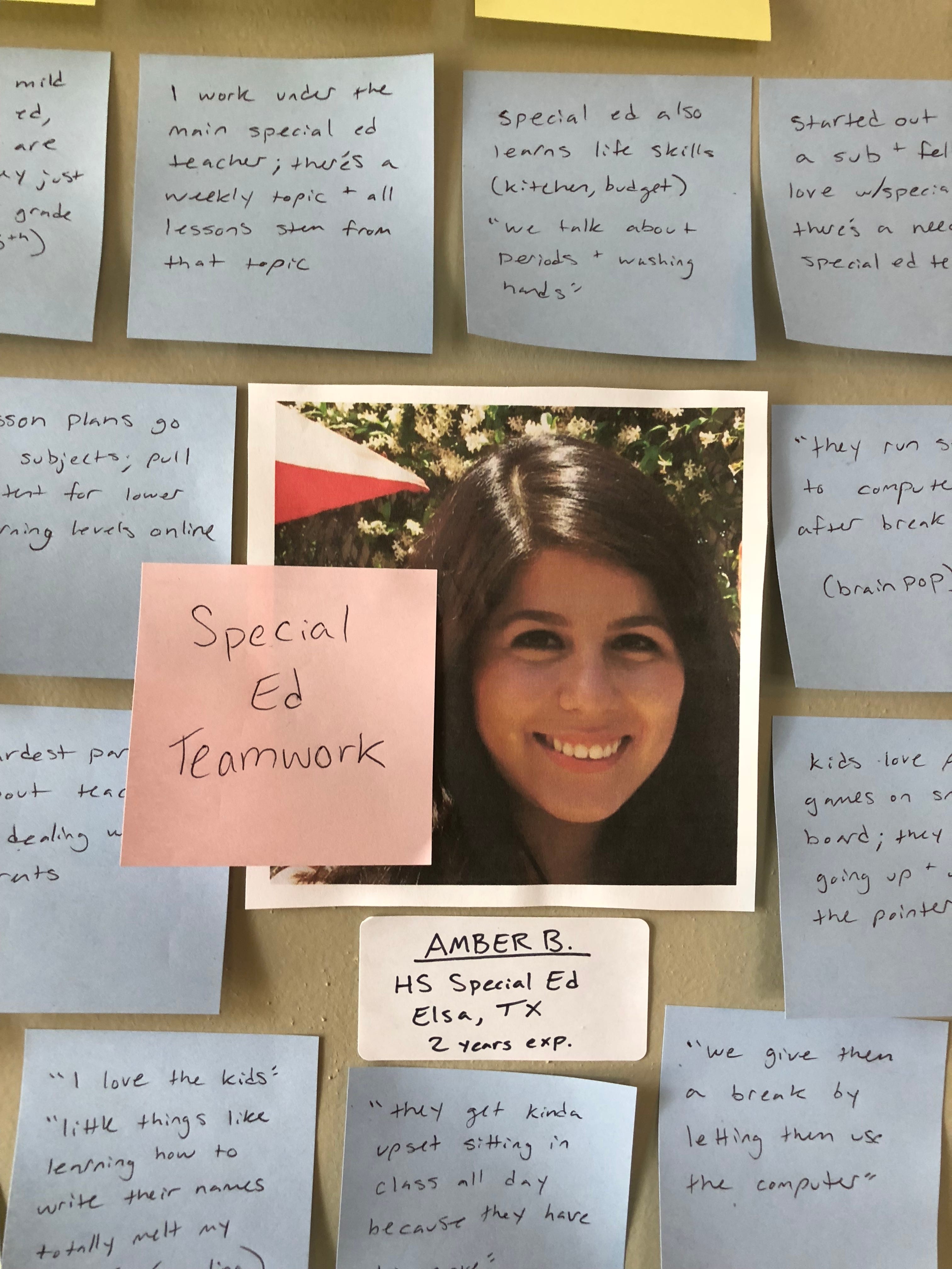
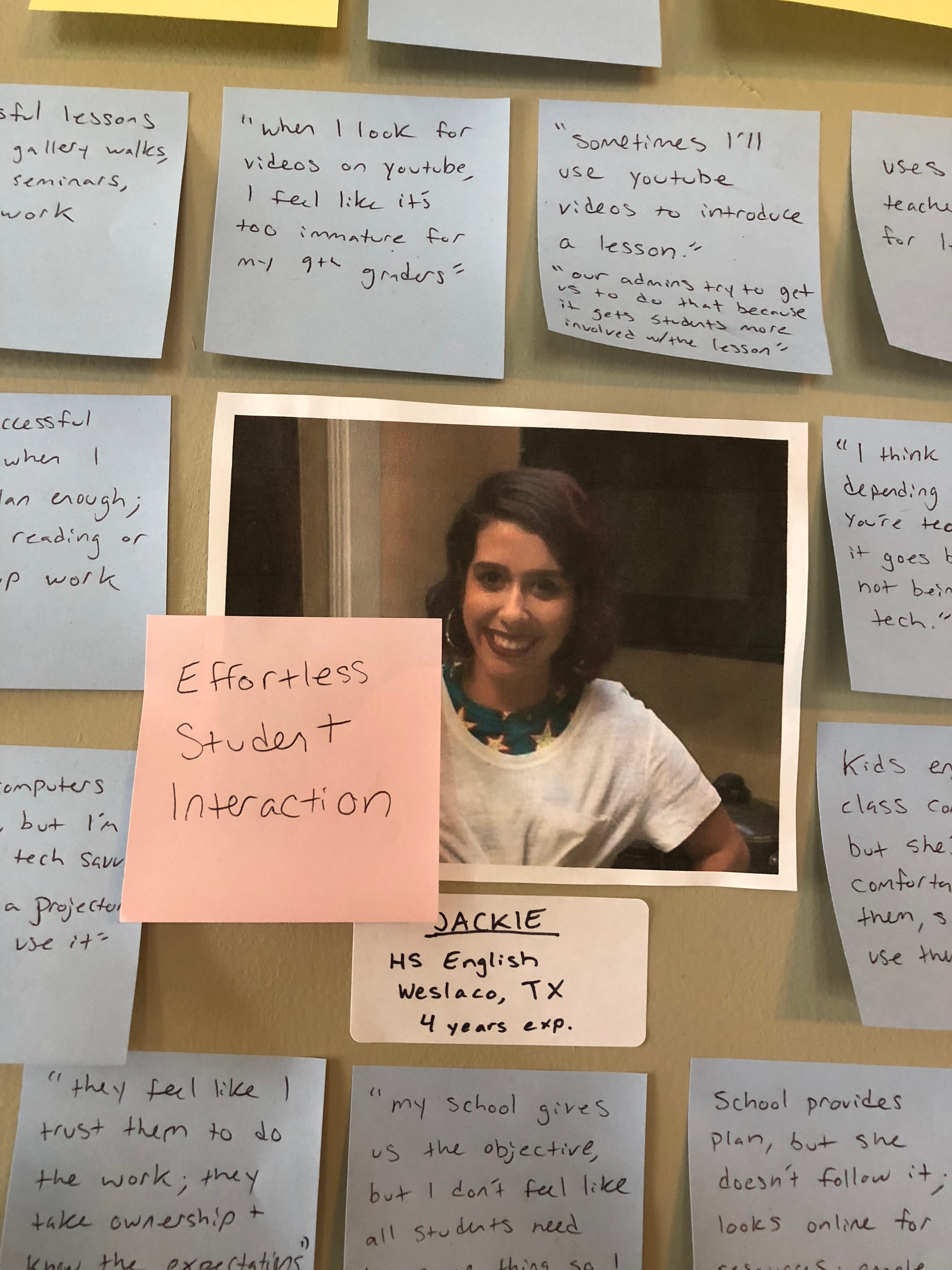
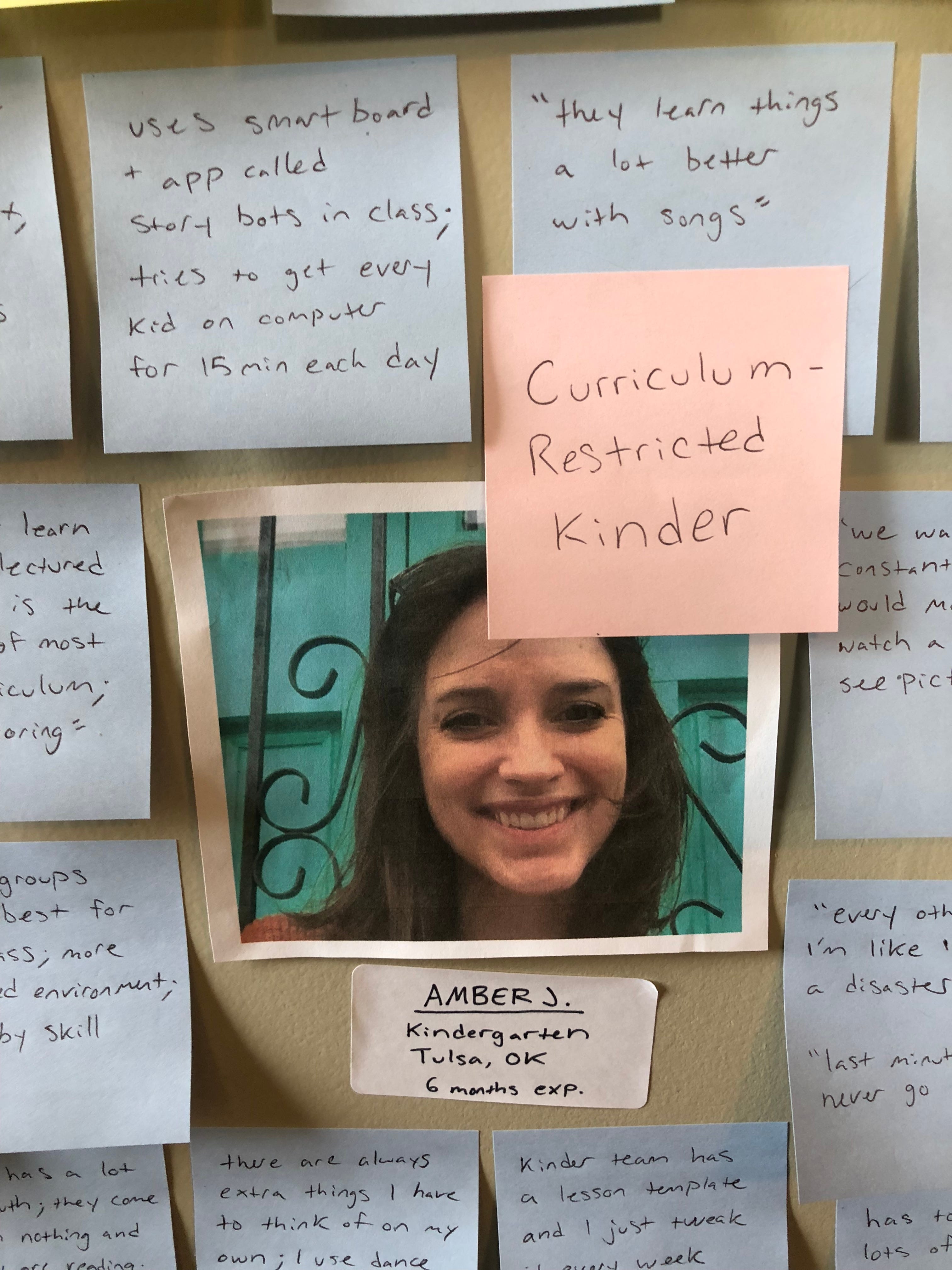
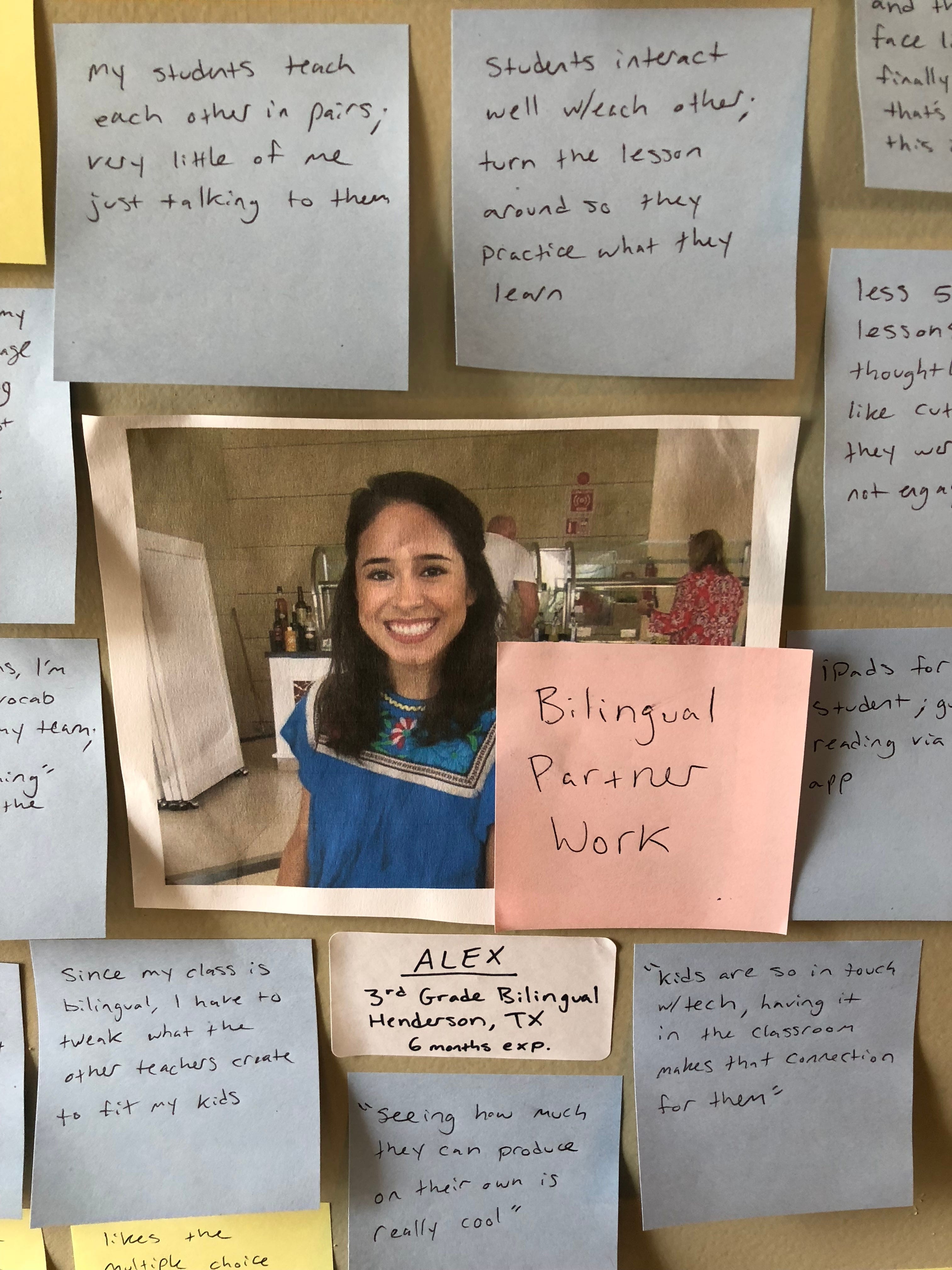
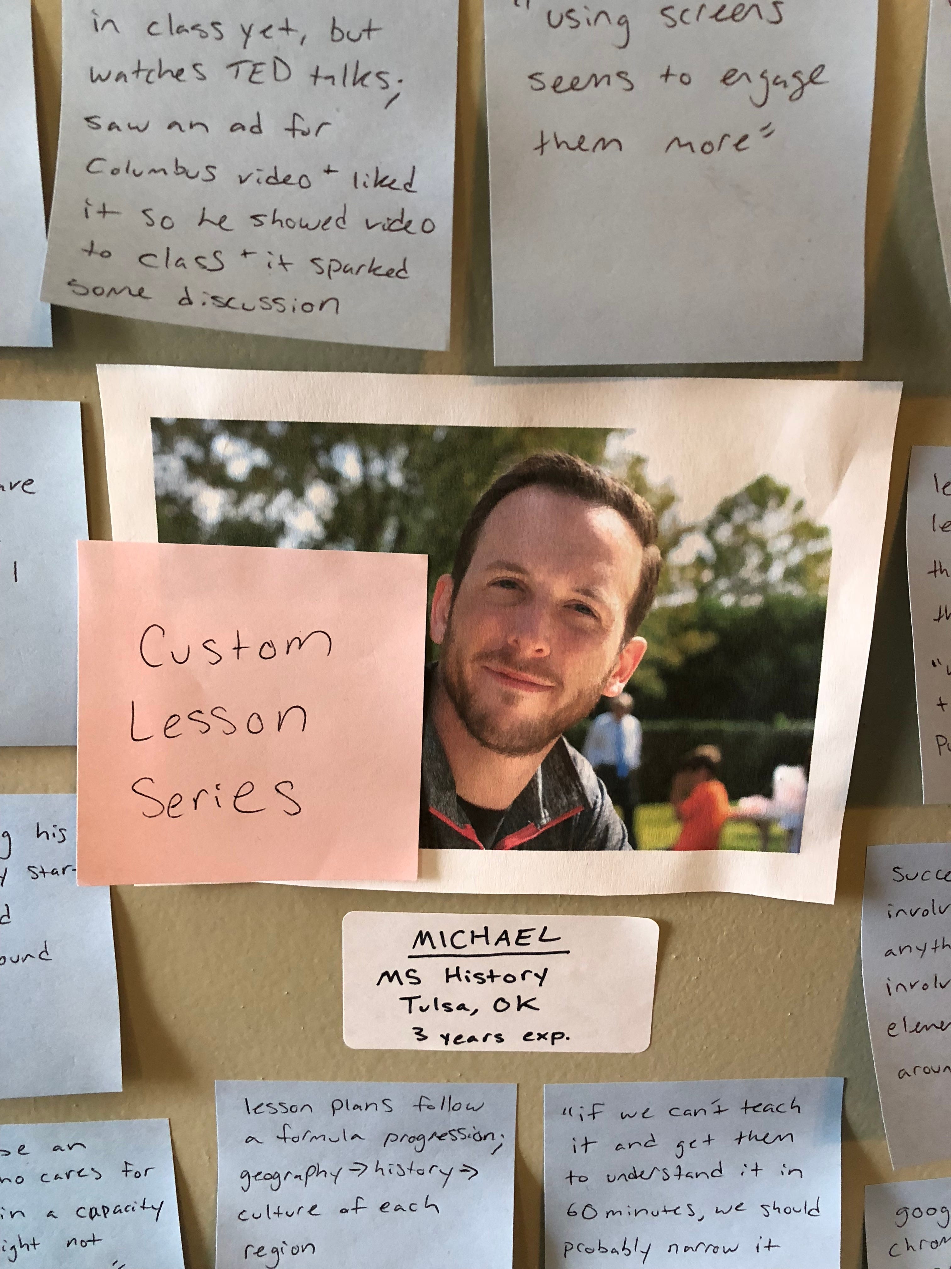
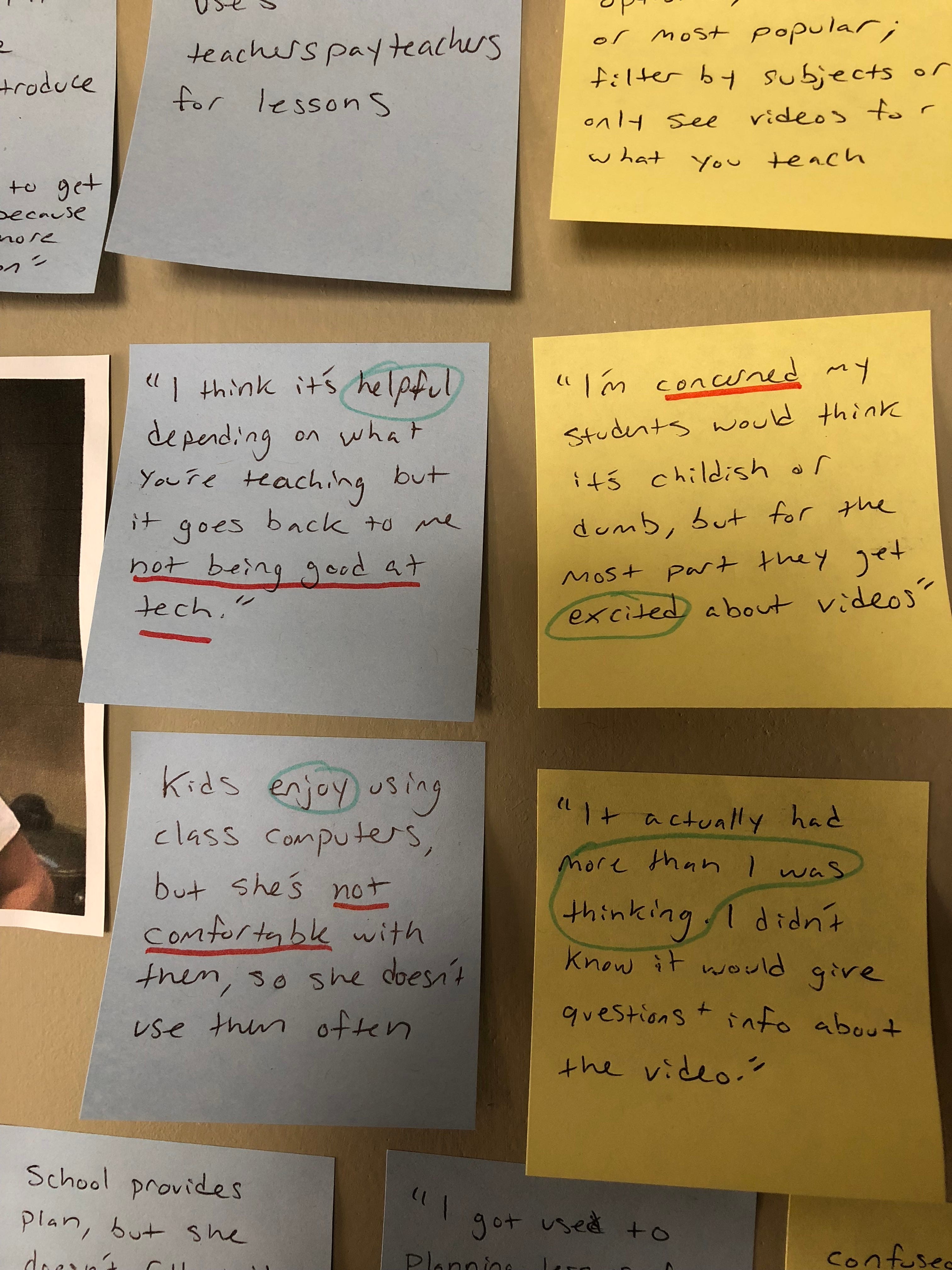
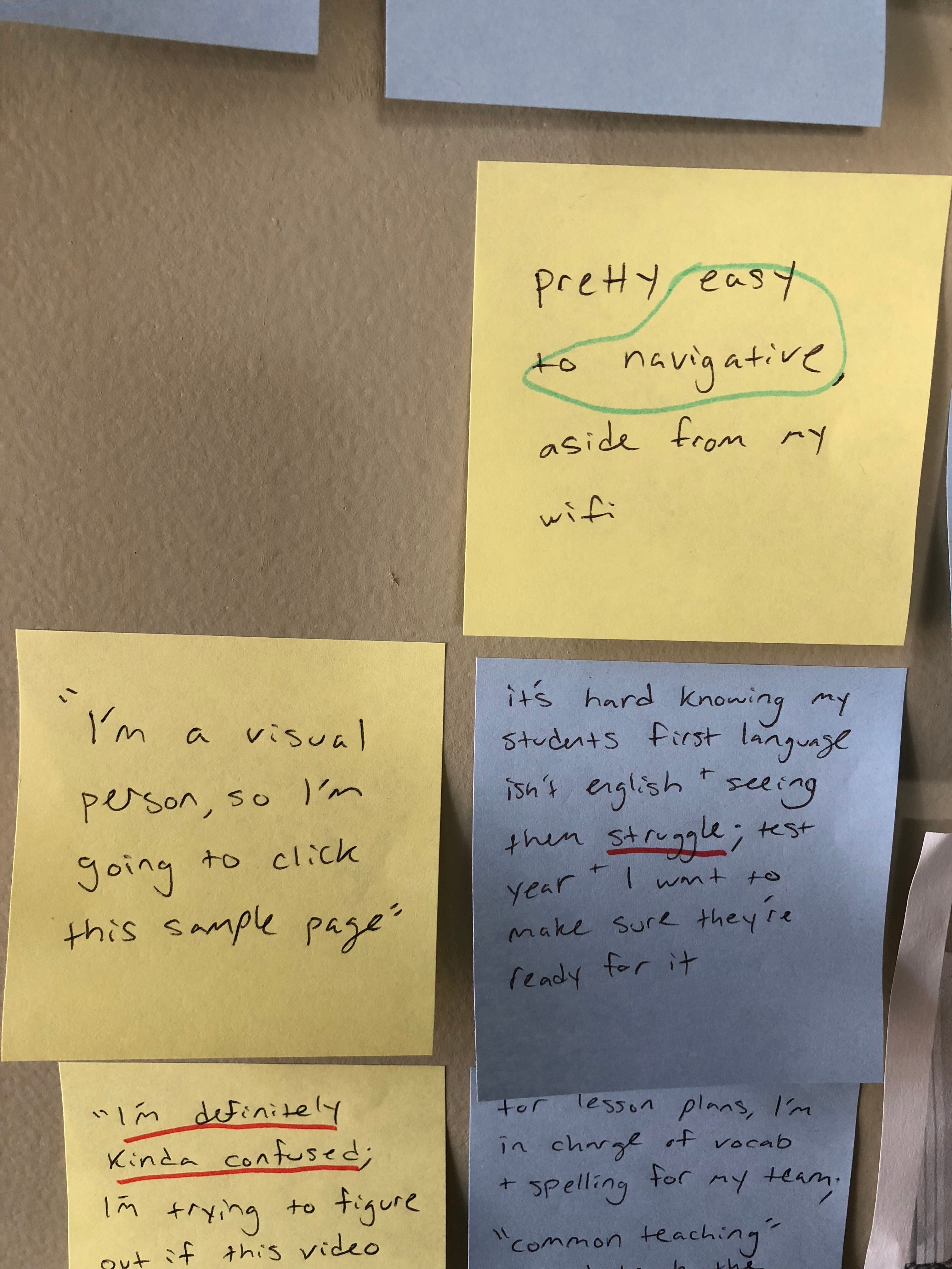
I then organized my interview notes and transferred the most important information to post-its, which I arranged around photos of my users on my wall, as if trying to solve a conspiracy theory.

I used blue post-its to represent general information about who the user is, how they teach, and their thoughts on education. I used yellow post-its to represent feedback regarding their experience with TED-Ed. And I used pink post-its to jot down some key words about each individual users’ needs, to be able to quickly reference throughout my design process.

Find Patterns:
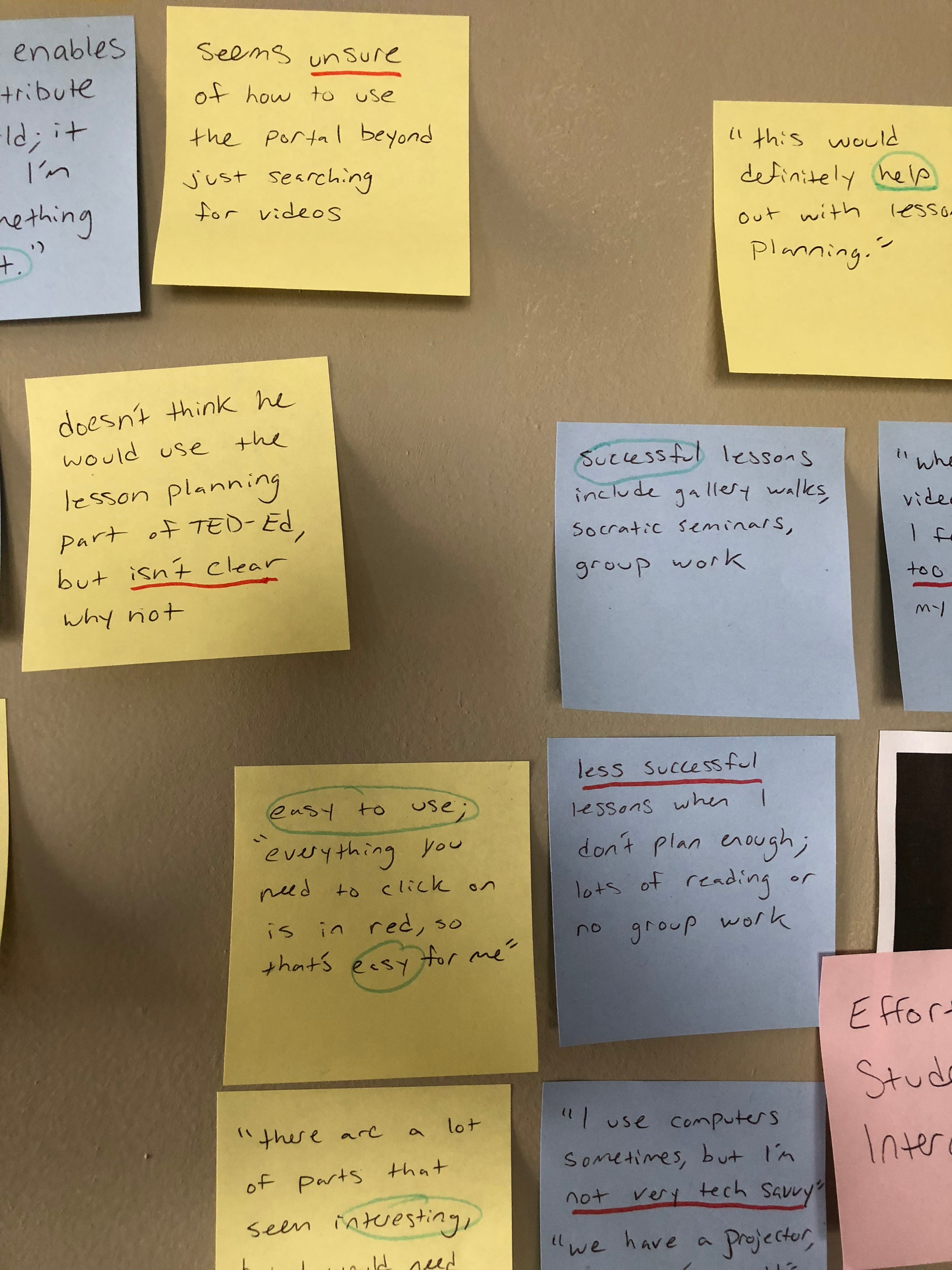
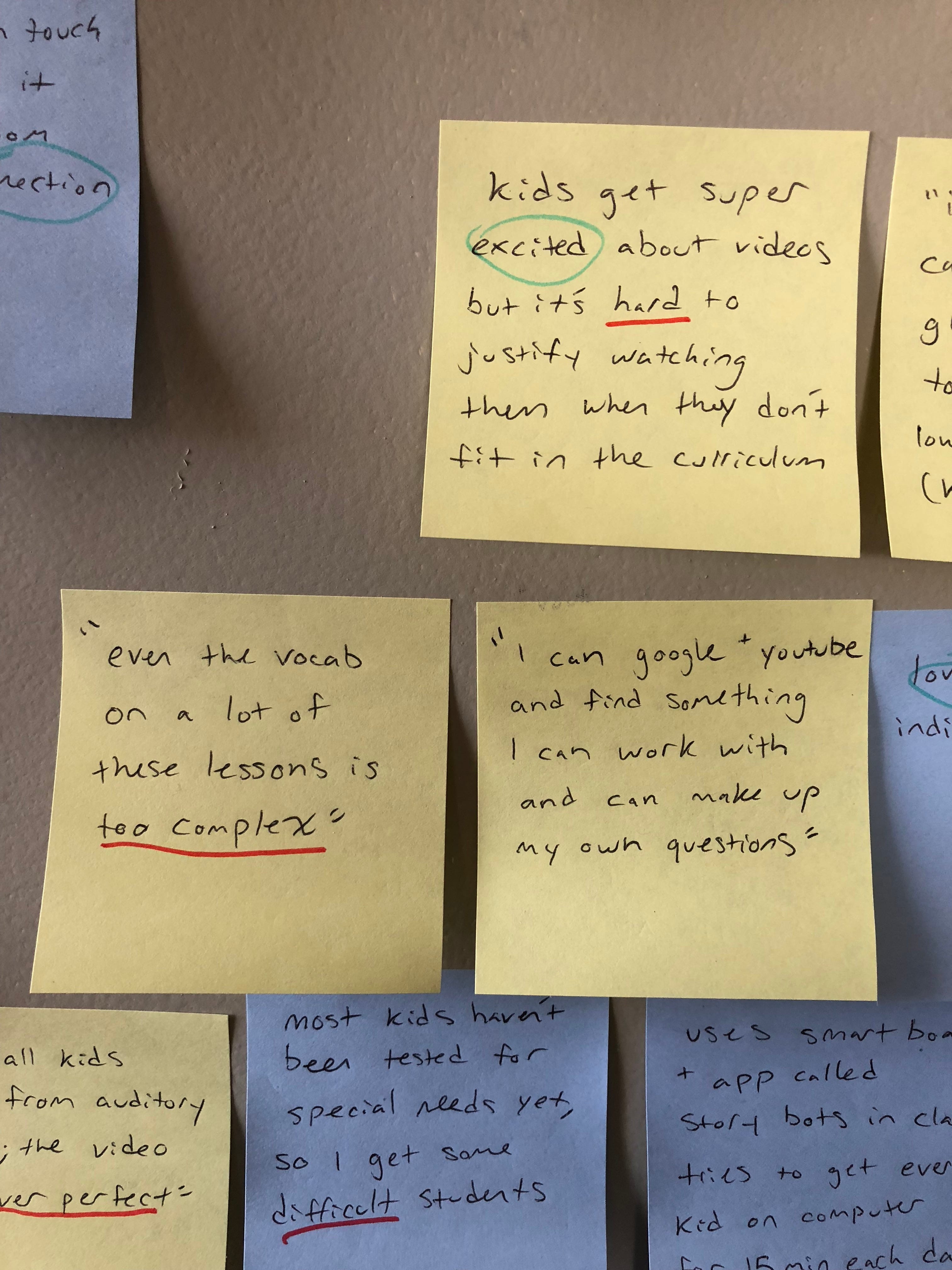
Now that I had all the information on my wall, I needed to start connecting the dots. To do this, I used a red marker to underline any negative feelings and a green marker to circle any positive feelings. By highlighting the most emotional feedback in this way, I was able to clearly see the pain points within the TED-Ed platform.
Define the Problem:
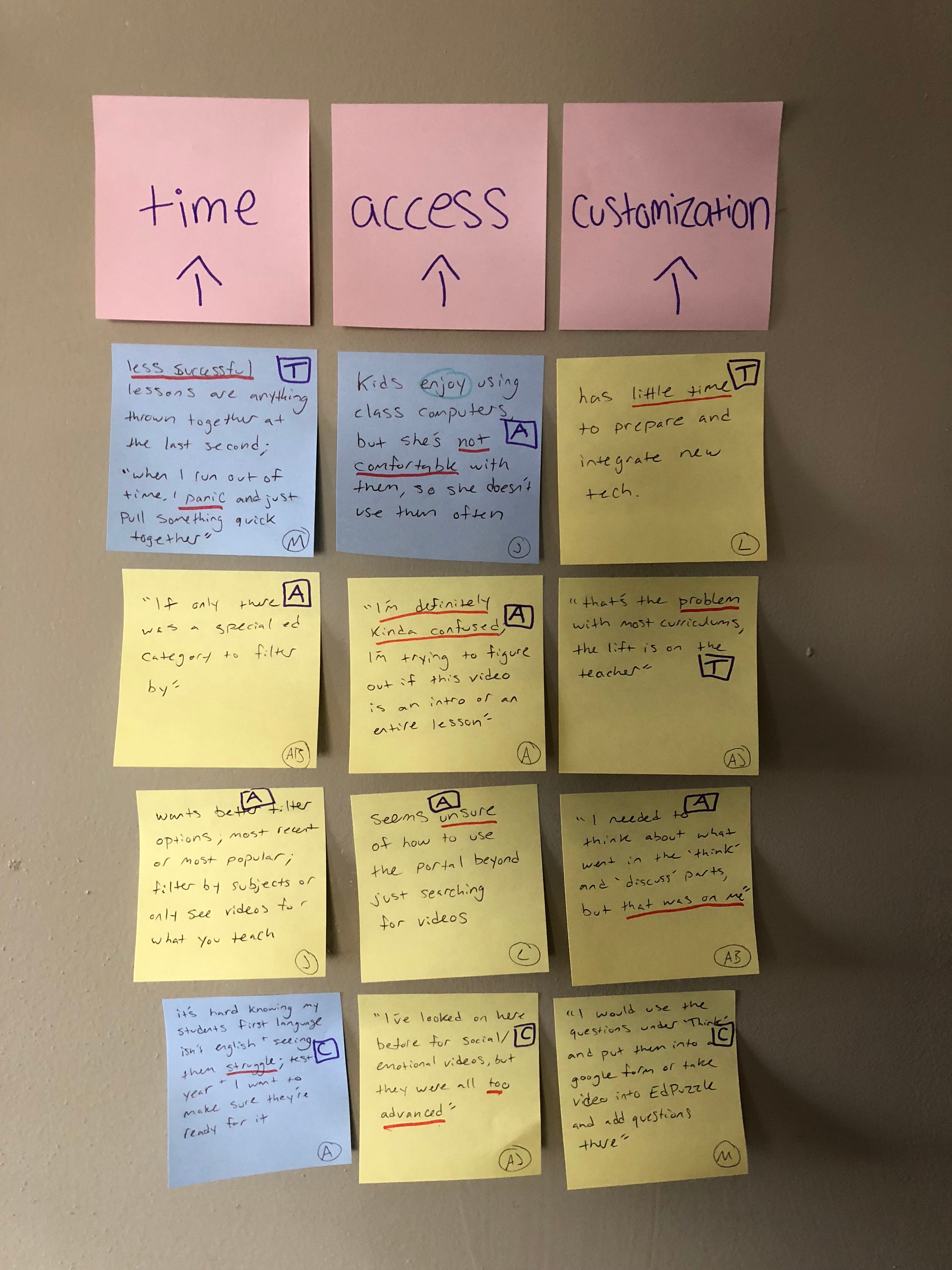
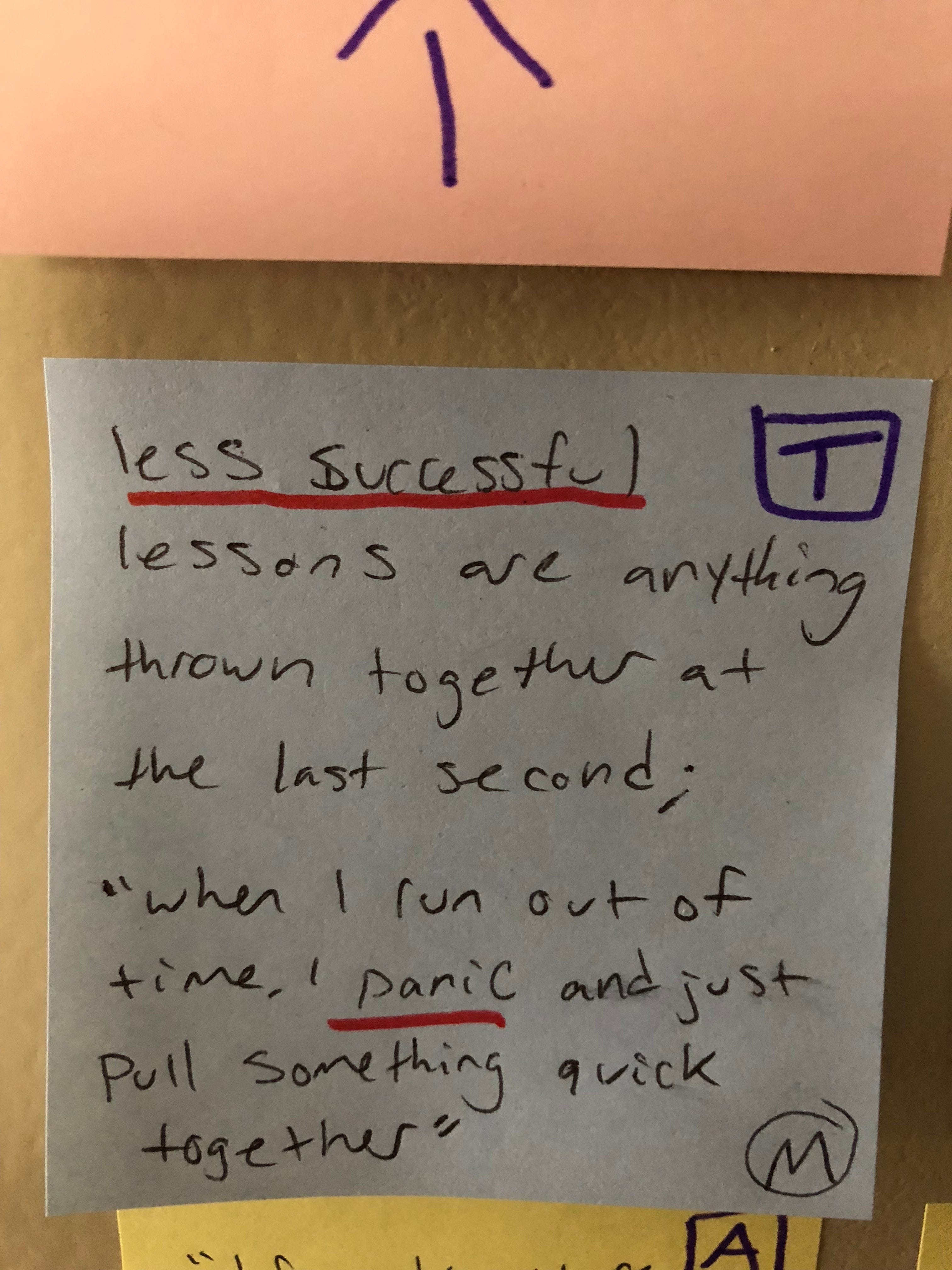
My next step was to move the most important post-its to the right of my wall and start looking for patterns. I found that the pain points my users mentioned seemed to fall under three main ideas: time, access, and customization. (See examples from each category, labeled by their respective letters, pictured below.)


These 3 ideas, along with all the insight I gained from my user interviews, and my knowledge of TED-Ed business needs, helped to narrow my focus for this project and determine my POV:
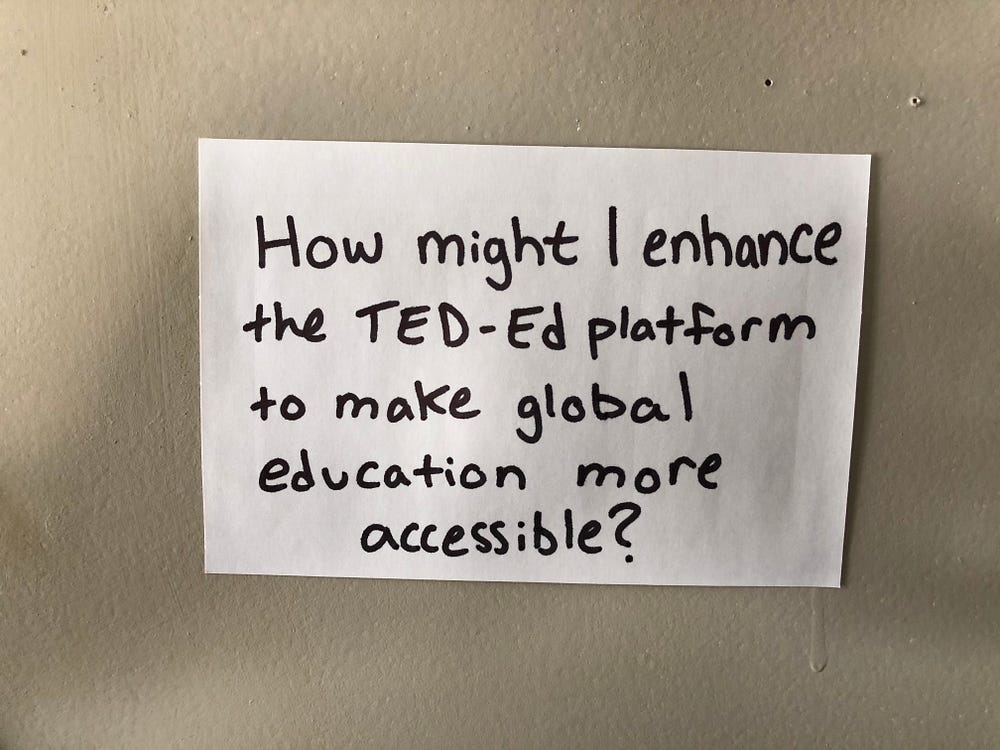
Defining the problem for this project was tough because there were so many pain points brought up in the user interviews and it seemed like every teacher needed something a little bit different. It was also challenging not actually being a user for this product because I couldn’t fall back on any of my own assumptions. This really helped push me to rely solely on the insight gained from my users to create a solution.
Personas:
“Each persona represents a significant portion of people in the real world and enables the designer to focus on a manageable and memorable cast of characters, instead of focusing on thousands of individuals.”
Source: A Closer Look at Personas via Shlomo Goltz
I used the data I gathered from unpacking my user interviews to create two personas: Miss Honey and Mr. Feeny

Miss Honey represents the less experienced, eager, and slightly overwhelmed teacher and Mr. Feeny represents the more seasoned, creative, and impatient teacher. Though there are several other personas I could have created, these are the two types of users I wanted to focus on for this project.
Consolidating multiple people into one or two personas can be difficult, but the process of doing so helped to challenge my understanding of my users.
Step 3: Ideate
Brainstorm:
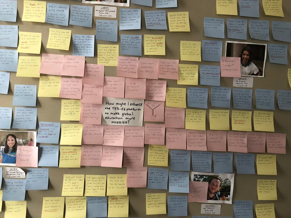
With my problem defined, I set out to brainstorm as many solutions as possible. I welcomed the crazy, the ridiculous, and the near impossible. Each idea, no matter how obvious or insane, was given a voice by means of a pink post-it and a place on my wall.
Sketch:
Then I moved to my trusty moleskine for some visual brainstorming and thumbnail sketches.
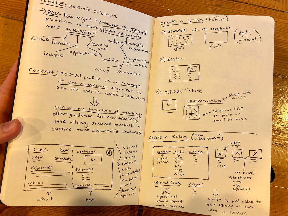
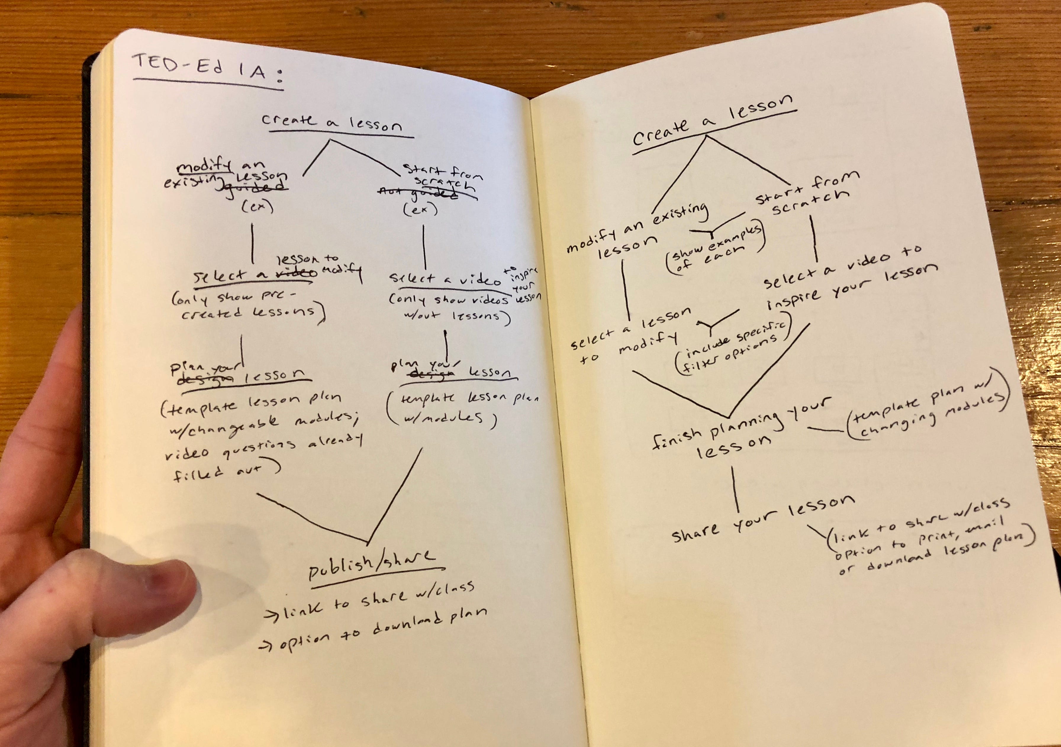
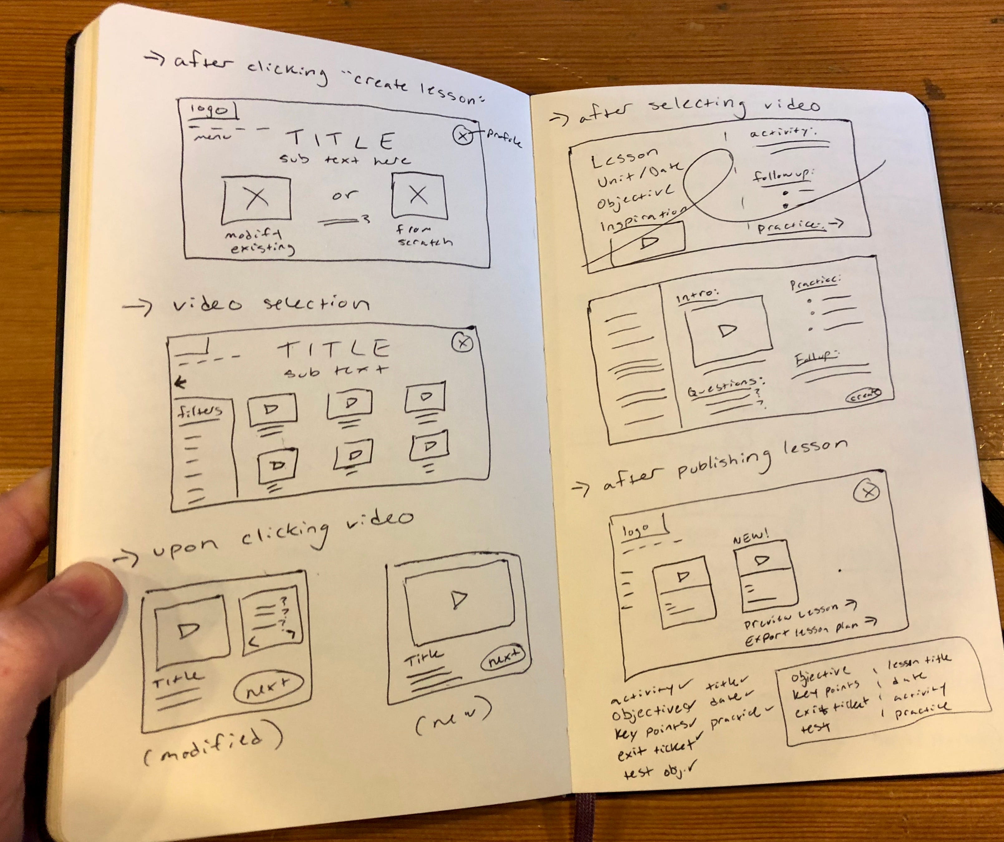
I find that when I’m able to step away from my computer and spend some time with my moleskine, I really start to clarify my project intentions.
Here are a few concepts that came out of my visual brainstorming session:
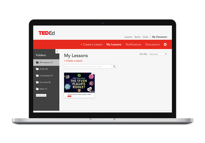
- The TED-Ed profile page should be an extension of the classroom, organized to suit the specific needs of each class.
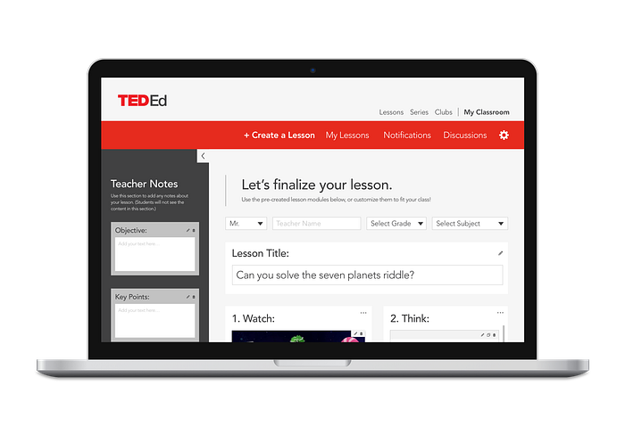
- Creating a lesson within the TED-Ed web app should mirror the structure of teaching, offering guidance for new teachers, while allowing seasoned teachers to explore more customizable features.
Step 4: Prototype
Low-Fidelity Prototype:
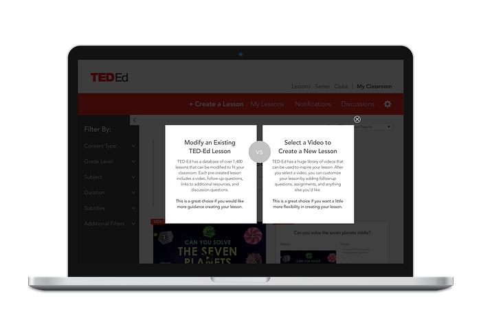
I wanted to keep accessibility at the forefront of my design. Some of the biggest issues my users had with the TED-Ed app were the inability to find the videos they were looking for, confusion over the difference between modifying an existing TED-Ed lesson and creating their own, and uncertainty about how to customize their lesson.
I knew teachers would not have any extra time to figure out how to use a new resource for creating lessons, especially when they already have a method in place that they are familiar with. So, I made it my goal to create a resource that was easily customizable and that would help make lesson planning more enjoyable.
I wanted to test the functionality and flow of my proposed solution with users before getting too wrapped up in the design, so I created a low-fidelity prototype in Sketch and then added functionality using InVision. For this prototype, I concentrated on content, layout, and user interaction, leaving design and style on the back-burner.
“Users become overwhelmed when their search terms result in seemingly irrelevant results, or too many results to process. Filtering and sorting help users narrow down the data”
Source: Best Practices for Search via Nick Babich


Step 5: Test
Low-Fi Usability Testing:
Feeling conflicted about who I should be testing my low-fi prototype with, I sought out the advice of my unofficial (but basically official) UX mentor, Kayce Reed-Buechlein. She gave me some great advice:
“Select the the users you think can understand on a conceptual level for the first round of testing. Pick those that you think are more visual in nature for the second round of testing at higher-fidelity”
That made a lot of sense. As I tried to determine which of my users were more conceptual and which were more visual, Kayce offered me another golden nugget of wisdom:
“I think the key is thinking about the type of feedback they gave you initially, to determine how they can best help you in testing”
So, I reached out to the three of my original users that I felt would be best suited to give me feedback on a conceptual level and was able to schedule usability tests with two of them.
I think I was equal parts terrified and fascinated by how my users interacted with the prototype. Fascinated by the ways their minds worked and how they navigated though screens in ways I hadn’t anticipated. Terrified by their long pauses, confused looks, and decisions to disregard any instructional text.
Unpack Again:
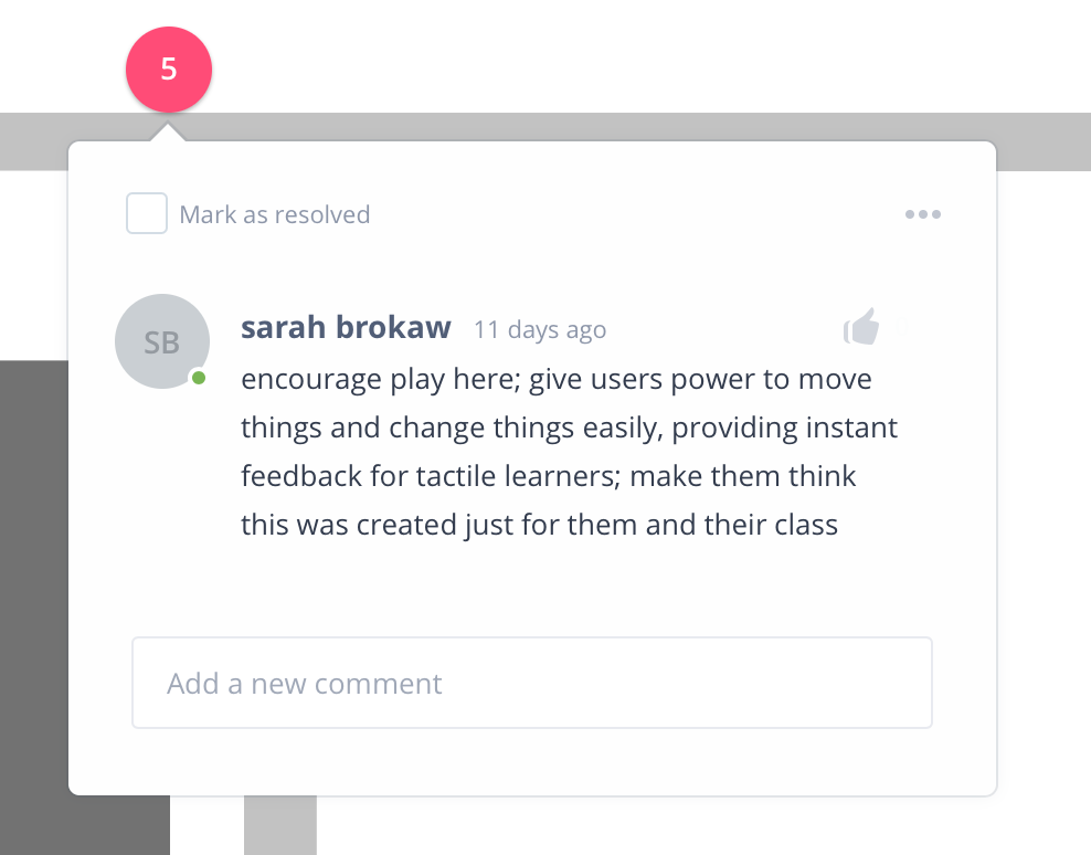
After transcribing the audio recordings from my usability tests, I added comments to my low-fi InVision prototype on the parts of the interface that users had issues with. Doing this made it easy to see which screens were the biggest issues and provided some focus for my redesign.

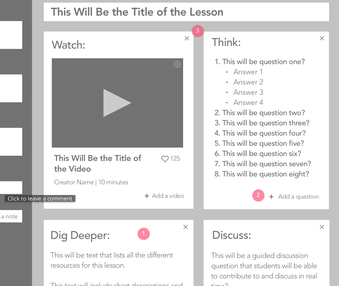


As you might be able to tell from the amount of comments in the screenshots above, the profile page (middle left) and the create your lesson page (bottom right) provided the most room for improvement.
Here’s a closer look at some of those comments:


Back to the Drawing Board:
After organizing all the feedback I got from my users on my low-fi prototype, I went back to Mr. Moleskine to refocus. I concentrated on the three biggest pain points brought up in usability testing and spent some time rethinking my approach to those problem areas.
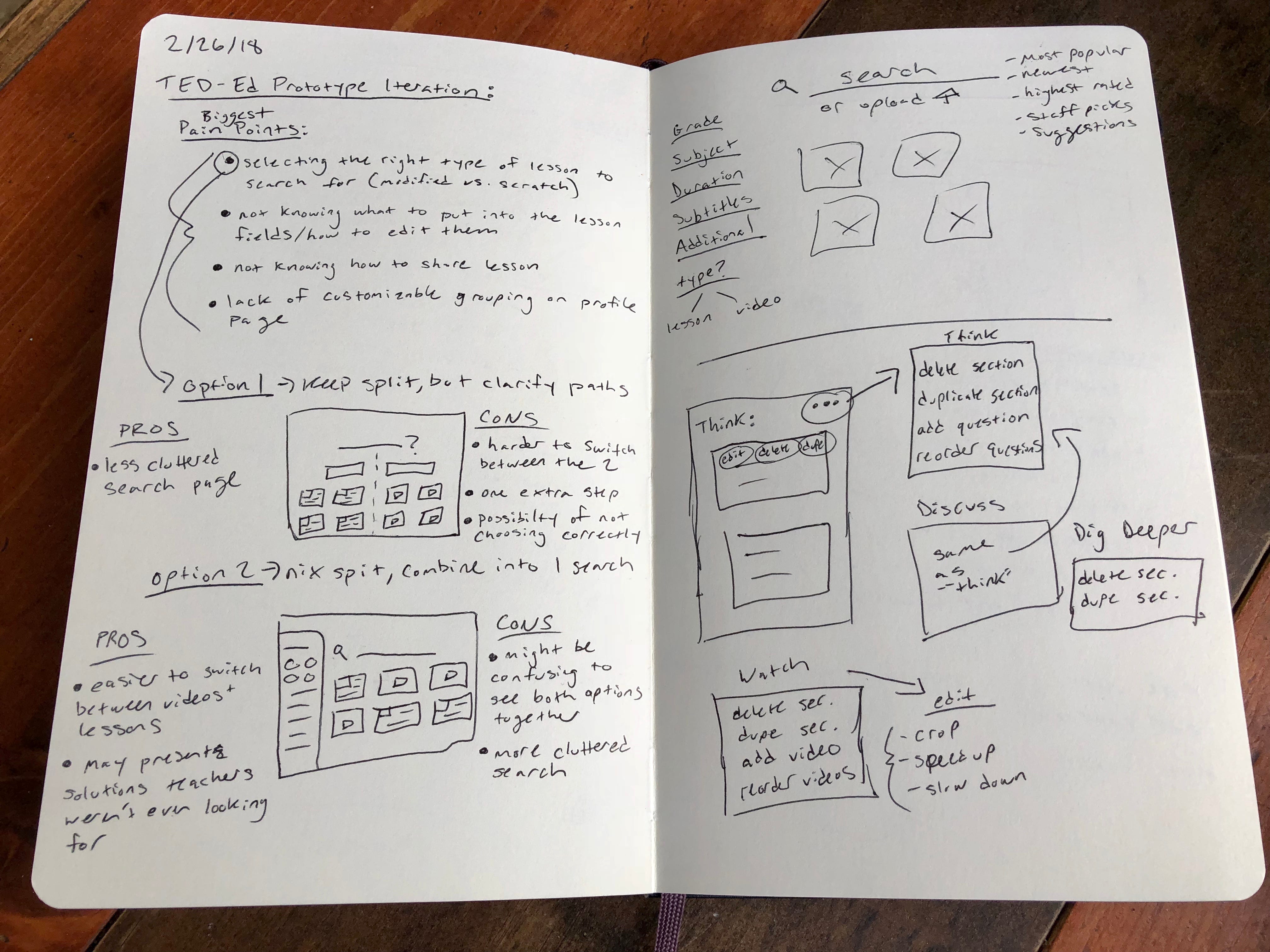

I worked through a few different options for a redesign, being careful to think through the pros and cons of each decision. I knew there wasn’t one golden solution that would be perfect for every teacher, but I wanted to find the next best thing.
Favorite Quotes:
Here are some of my favorite quotes from my low-fi testing, and why they are important:
Quote: “If it’s not labeled, I don’t think I would know that I could click it.” // Why it’s important: This highlighted an area where I was clearly designing for my comfortable-with-minimal-design-self and not for my much-less-tech-savvy users.
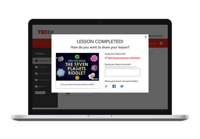
Quote: “It looks like I’ve started over again.” // Why it’s important: This was definitely one of the most terrifying moments of user testing, especially hearing it when a user was AT THE END of the process. But, this made me realize I needed to provide users with more pronounced feedback after completing a lesson.
Quote: “Normally you see three dots with the option to remove, edit, or delete.” // Why it’s important: This was one of those “why didn’t I think of that?” moments, where one of my users identified his mental model and explained how my design had disrupted it.
Quote: “I’m very tactile; I have to play. So if there was a video tutorial that popped up, I would immediately exit it.”// Why it’s important: This exclamation surprised me, as I had figured a video tutorial would be a great solution for this particular user. But if I’ve learned anything from user testing, it’s assume nothing.
Step 6: Iterate
High-Fidelity Prototype:
Creating my high-fidelity prototype was a little bit overwhelming at first because of the sheer quantity of feedback I received from my users in my low-fi testing. But after pushing through this step, I felt like the user flow made a lot more sense, like I was really starting to design for my teachers.
I caught myself thinking about my users and their individual pain points more often. Before designing an icon, I would stop myself and ask, “Would Larry know what this means?” When coming up with filter options, I would think, “Oh! I should add an option to filter videos that work well for ESL students for Alex’s bilingual classroom.” I started to understand the importance of testing often.

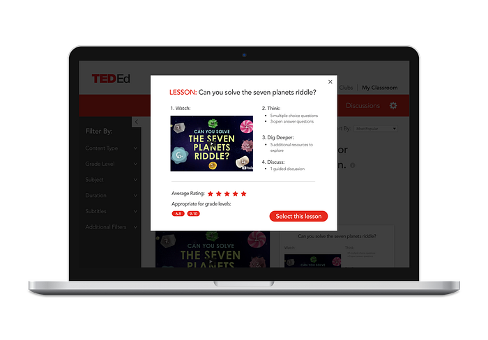
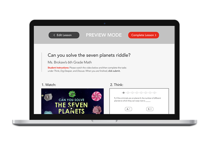
As you can see, I also added quite a few links to this prototype to provide an experience that was a little more realistic for my next round of usability testing.

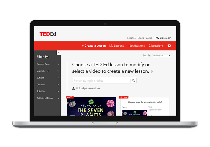
The biggest change I made moving from low-fi to high-fi was the decision to eliminate the split path where users could choose to create a new lesson or modify an existing one. Though I can’t say it felt amazing to cut out a large chunk of my work and completely rethink the user flow, it was necessary.
“If there is a mismatch between the person’s mental model and the product’s conceptual model, then the product will be hard to learn, hard to use, or not accepted.”
Source: 100 Things Every Designer Needs to Know About People via Susan Weinschenk
Here’s a look at some of the screens for my high-fi prototype:

Step 7: Test…Again
High-Fi Usability Testing:
Now that I had my high-fidelity prototype built, I was eager to get it in front of users. Per the advice of my wonderful mentor, Kayce, I reached out to 3 of my more visual users and was able to schedule meetings with 2 of them.
Going into this third round of testing, I didn’t know what to expect. I had made a lot of changes since my low-fi prototype and was anxious to see whether I was able to translate the pain points of my low-fi testers into a more natural, effortless flow.
Thankfully, this round of testing ran much smoother, in part because I was more comfortable with running usability tests, but also because the prototype was much more intuitive and needed less explaining.
Favorite Quotes:
Here are some of my favorite quotes from my high-fi testing, and why they are important:
Quote: “I really liked it. It’s very easy to navigate through and it’s pretty straightforward.” // Why it’s important: This tells me that the improvements I made to the user flow after low-fi testing were successful, as my low-fi testers struggled a lot with navigation.
Quote: “Yeah, that was exactly what I was expecting to see.” // Why it’s important: This was reassurance that the content I created made sense to my users. I also decided this is by far the best thing to hear from users during usability testing.
Quote: “So it’s basically like a folder.” // Why it’s important: This was just one of those face palm moments for me. One of my users offered this effortless realization after I struggled to explain the purpose of using tags to categorize lessons.
After transcribing my meeting notes again, I looked them over for potential areas of improvement within my design. I realized there were some simple changes I could make to perfect my prototype.
Little things like clarifying some wording and tweaking icons would make my design more accessible. And, though these changes may seem rather small, I wanted to do everything I could to make this experience effortless and delightful for my users.
I can’t single-handedly overturn the education system or pay teachers more or make people give them the respect they deserve, but if I can design something that will improve even a small part of their lives, it’s worth it.
Final TED-Ed Prototype:
If you’re curious to see how it turned out, check out my final prototype by clicking the link below.
Final Thoughts
Well, there you have it. Another UX project completed and many a lessons learned. This project involved so much, and yet I’m left pondering all the ways to supplement the design of the TED-Ed web app to make it even more accessible and inclusive.
I am so thankful for the brilliant minds that have shared their UX wisdom with the world, making transitioning into this extraordinary field possible: Sarah Doody, Nick Babich, Mo Goltz, Nicola Rushton, and brad dalrymple.
And I am forever grateful to the beautiful souls who have gone out of their way to help me navigate this new land and make it my own. Special thanks to my BFF, jake brokaw, my unofficial (official) UX mentor, Kayce Reed-Buechlein, and the wonderful teachers that helped make this project possible: Jackie Broshears, Alexandria McClain, Amber Briales, Michael Seng, Amber Jeffries, and Larry Cagle.
Show this project some ❤️ by 👏👏👏 or sharing it on your favorite social platform. If you enjoyed this post, you might also fancy my last UX project, Kindara: My First UX Case Study.
👉 I am currently seeking FT remote UX design opportunities. For inquiries, email me at: sarahshelbybrokaw@gmail.com.
I will leave you with this clip of two amazing humans doing what they can to improve our education system, in hopes that it may inspire you to do the same. ✌️💕
“There are some really phenomenal teachers. So the dream is that you could take that top ten percent and have them help the others to get the best teaching ideas to spread across the country.”
This story is published in Noteworthy, where 10,000+ readers come every day to learn about the people & ideas shaping the products we love.
Follow our publication to see more product & design stories featured by the Journal team.
